brand development
identity
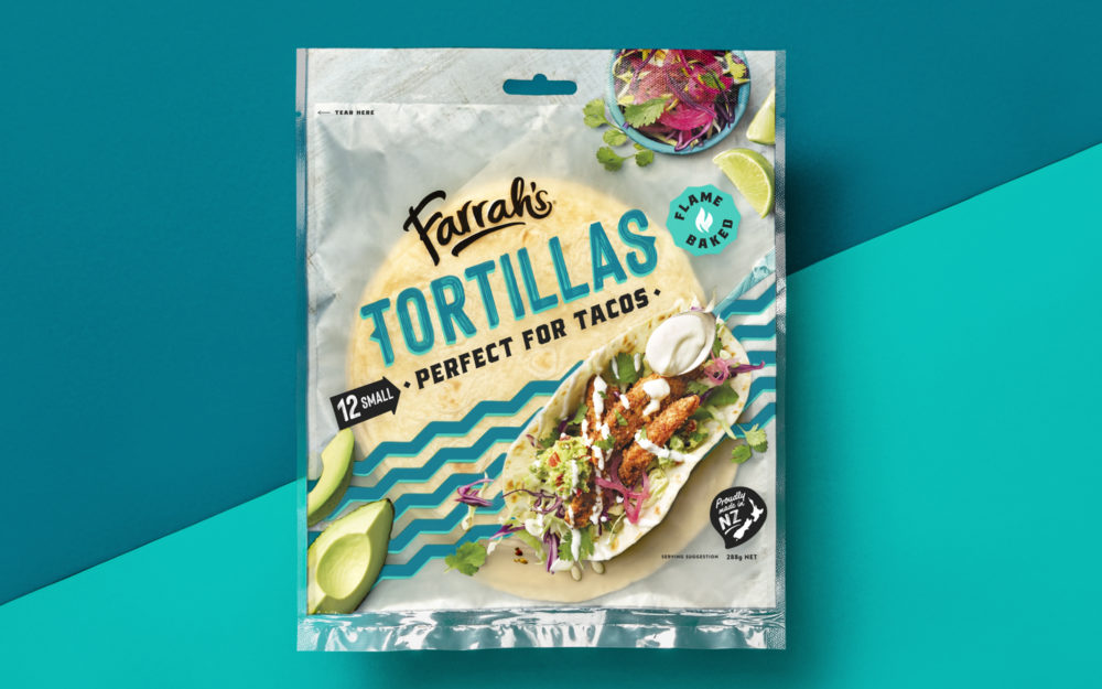
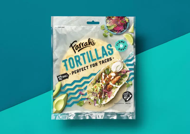
packaging
communications
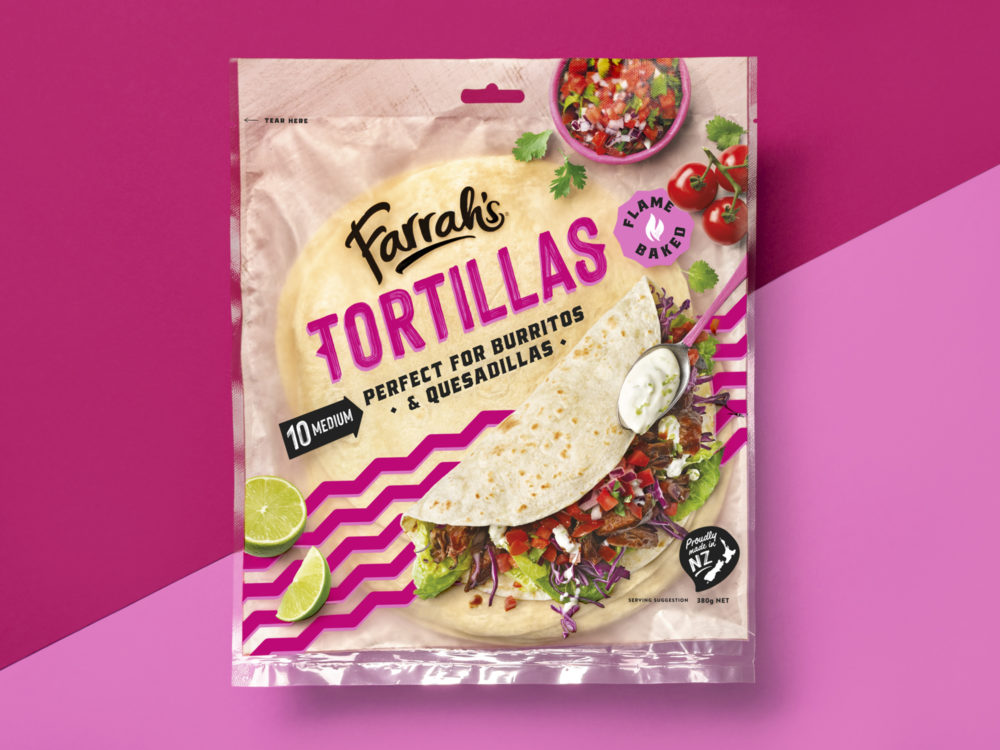
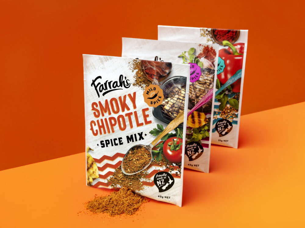
Farrah’s Mexican range had been performing well in a category dominated by a long-established overseas brand. Changes among other competitors and insights gained from the existing packaging’s performance gave us a rare opportunity. Not just to secure Farrah’s as number two in the category, but to shake up a genuinely ‘hot’ sector and propel the brand towards market leadership.